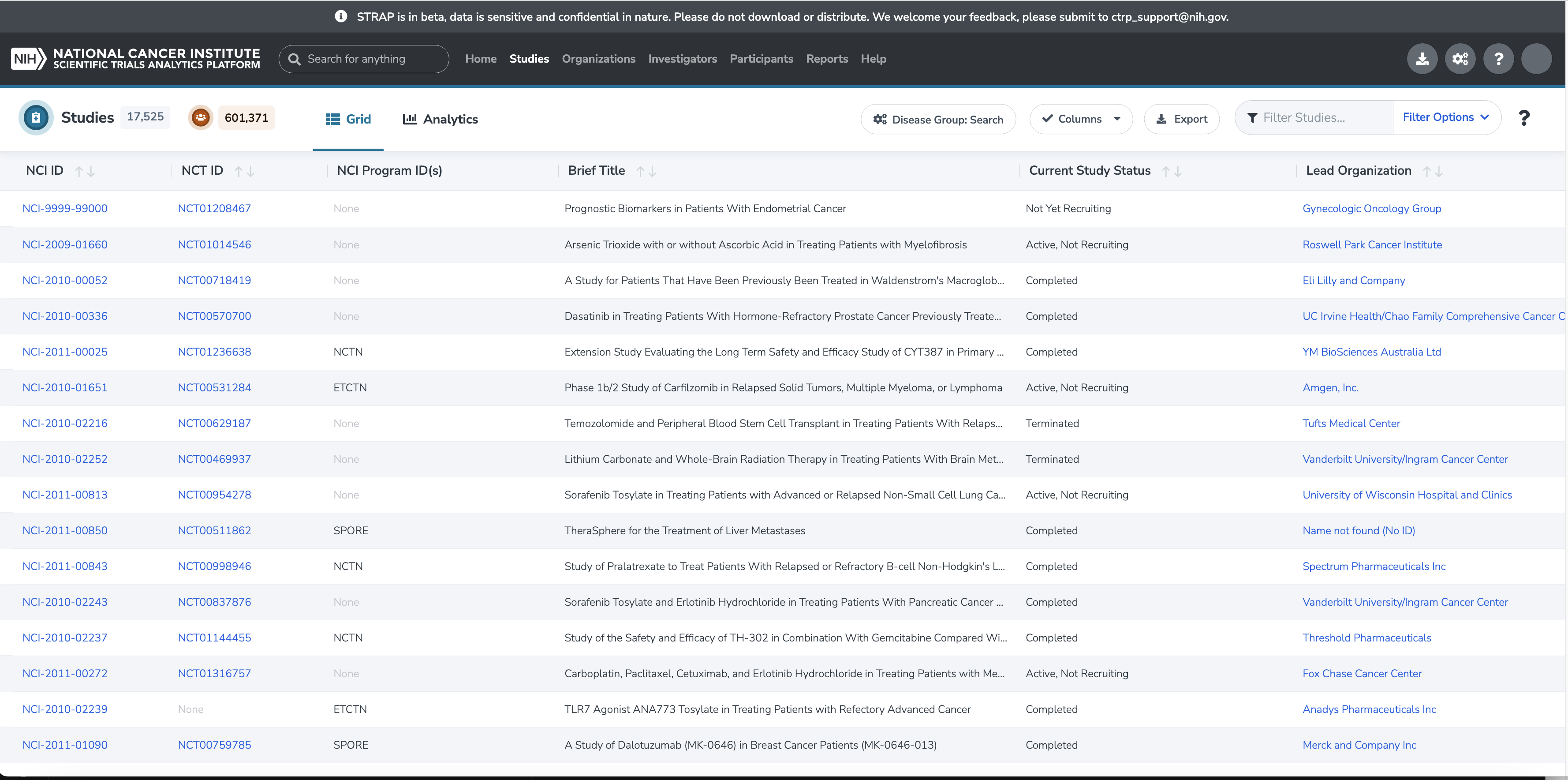
Data Grid
The Data Grid may appear as part of the Search page, or it might appear in a popup window, depending on the location in STRAP from where it is activated. The grids all share a common set of features: columns with labels and sort arrow buttons, rows containing the record data (sometimes including links), as well as controls for the grid.
Data Grid Controls
You will see the following controls at the top or bottom of a Data Grid:
- Pagination picklist and paging buttons
- Columns widget
- Export button
- Open Filters button
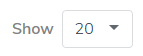
Pagination
At the bottom of the Data Grid page, the pagination picklist allows the user to select the number of records visible on a page. This gives the user the flexibility to customize the amount of records to display at one time.
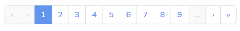
Also at the bottom of the Data Grid are the paging buttons. These allow navigation between pages of records.
Columns
Hide/Show Columns
There is a hide/show Columns widget button in the top-right of a Data Grid. Clicking on the ‘Columns’ button opens a panel listing all of the available columns for that Data Grid. Each column name has a checkbox next to it.
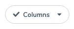
If the checkbox is checked, the column is visible. If the checkbox is not checked, the column is hidden.
A subset of the columns is visible by default, but the user can choose any combination of available columns to make visible and show in the Data Grid.
Sort on Selected Column
The data can be sorted on a chosen column in an ascending or descending sort by clicking on the up/down arrow icon next to column label.
Columns with Links
Some columns contain data that provides a link to another page with further detail. Except where noted, the data in these columns will be in blue text and will show link controls (underline and ‘hand’ cursor) on mouseover. Clicking on the blue text in the cell of a Data Grid will navigate to a detail page related to the cell value that was clicked on.
Export
There are export controls in the application that can be accessed from a button at the top right of a Data Grid.

Clicking on the ‘Export’ button activates a pull-out panel containing configuration settings for the download of the data in the Data Grid.
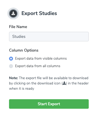
The download panel provides the opportunity to select which columns from the Data Grid will be part of the download. It should be noted that the entire data set will be included in the download, not just the page that is visible on the screen when the download is initiated. As mentioned in the panel, once the export file has been created, it will be available by clicking on the download icon in the top navigation bar.

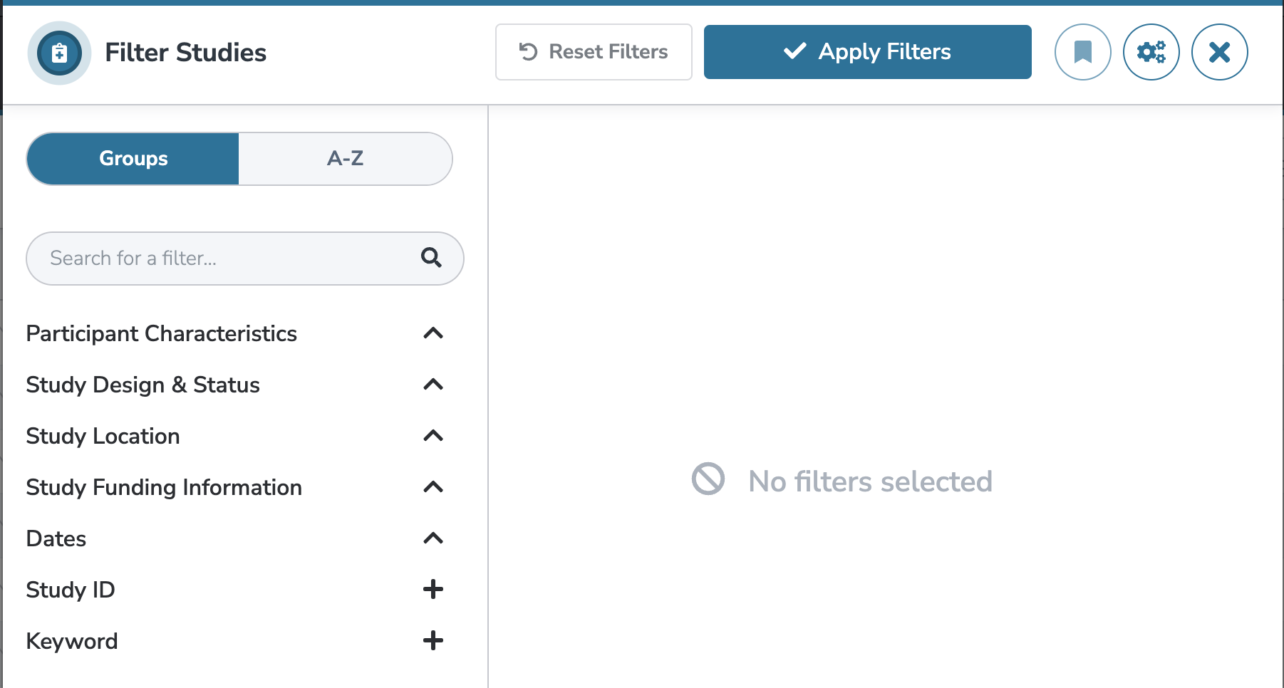
Filters
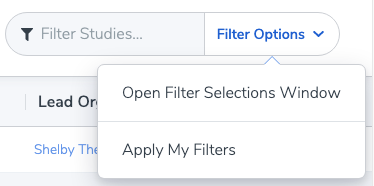
There is a “Filter Options” button at the top right corner of a Data Grid, adjacent to a “Filter Studies” textbox. These filters can be used to apply filtering criteria to the data set in the Data Grid. The textbox can be used to filter the records in the current dataset by the entered keyword. For more complex (and saved) Filters, use the “Filter Options” button.

Clicking on “Filter Options” opens a drop-down menu with two options: “Open Filter Selections Window” and “Apply My Filters”.
Clicking on “Open Filter Selections Window” activates a pull-out panel.
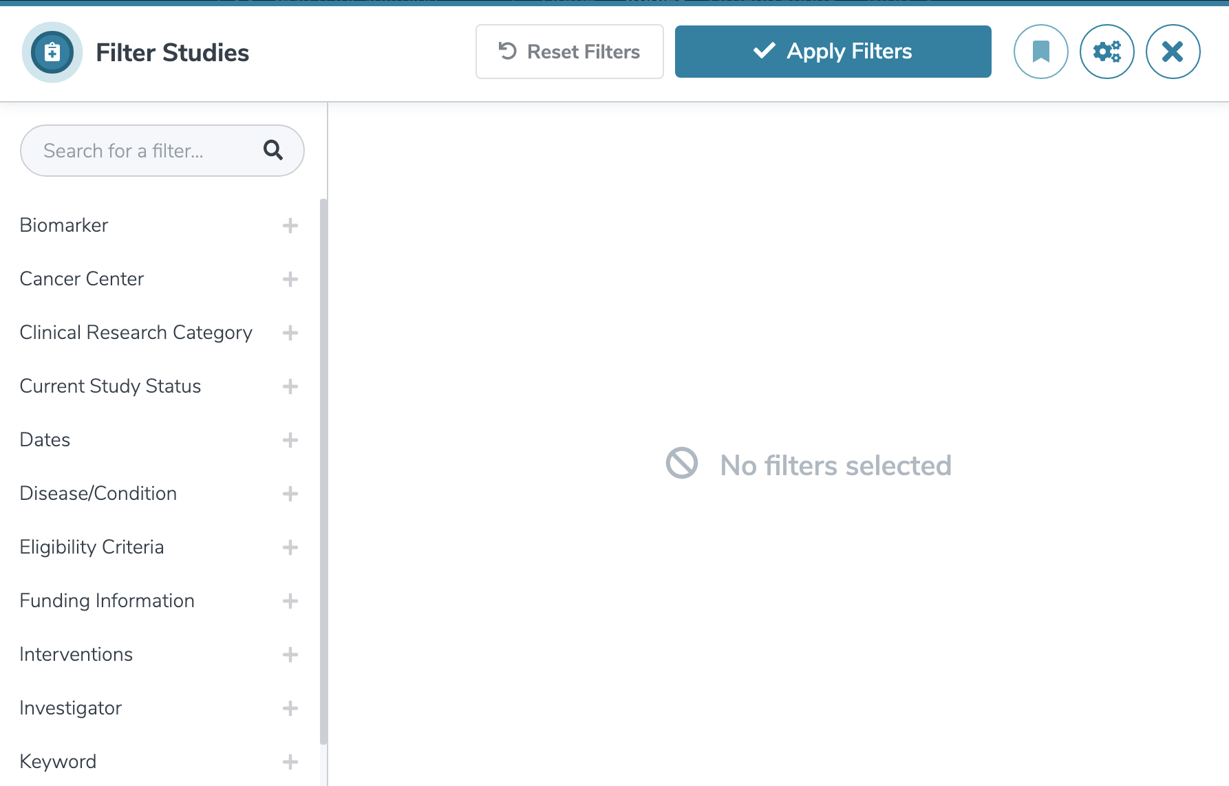
This panel lists very specific criteria and uses checkboxes to allow the user to quickly select the filter details.